Ranking Arsenal’s 10 Best Kits of All Time: Retro Rises to the Top
Home/Soccer
Ranking Arsenalâs 10 Best Kits of All Time: Retro Rises to the Top
The Gunners have produced some stellarâand often daringâkits over the years.

By Barnaby Lane
7:10 AM EST
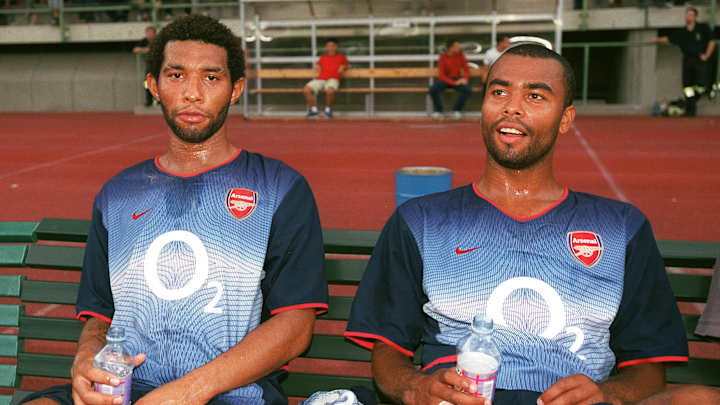
What a duo. / Getty/Stuart McFarlane
Arsenalâs colors are unmistakable: Red and white. Itâs a combination the Gunners are known for the world over.
While that pairing has remained the foundation of most home kits through the years, the club has never been afraid to experimentâadding subtle flourishes, bold reinterpretations and forward-thinking design touches to refresh a timeless look.
When it comes to away and third strips, Arsenal may boast one of the strongest collections of weird, wacky and wonderful kits in Premier League historyâif not world soccer.
Here, Sports Illustrated ranks the 10 best Arsenal kits of all time, from the elegantly simple to the daring and unforgettable.
FREE NEWSLETTER. New SI FC Newsletter Global Embed. Sign Up to Get Informed With SI FC. dark
10. adidas is Back (2019-20, Home)
Arsenal returned to adidas in 2019. / IMAGO/PA Images
After 25 years with Nike and PUMA, Arsenal reunited with adidas for the 2019â20 seasonâand the comeback was a triumph.
The design tipped its hat to classic earlyâPremier League adidas kits while feeling slick and modern: A bold red body, crisp white sleeves and a smart white collar trimmed with red and black. The iconic three stripes returned proudly across the shoulders, completing a look that blended nostalgia with freshness.
It marked Mikel Artetaâs first season in chargeâand ended with FA Cup glory, giving the kit instant classic status.
9. A Bolt from the Blue (1994-95, Away)
Pure '90s madness. / IMAGO/Colorsport
The same season they unveiled an electric-style home shirt (more on that shortly), Arsenal also rolled out an equally high-voltage away kit.
Where the home design was a bit more restrainedâalbeit still eye-catchingâthe away version truly pushed the boundaries. It featured a bold split of deep navy and patterned lighter blue, divided by jagged, lightning-bolt-style stripes slicing down the front.
Finished with sharp red trims and a watercolor-style Arsenal crest washed across the chest, it was daring, distinctive and unapologetically different.
8. Stunning in Sega (2001-02, Away)
Wiltord was a cult hero for Arsenal. / Getty/Mark Leech
Between 1999 and 2002, Arsenal experimented with dual branding on their kits: Dreamcast featured on their home shirts, while Sega appeared on the away strips, coinciding with the global launch of the Sega Dreamcast console.
Much like the console itself, the Gunnersâ striking gold, Sega-sponsored away kit of 2001â02 was a showstopper.
Bold, memorable and unmistakably early-2000s, it has since become a cult classicâespecially as Arsenal went on to lift the league and FA Cup double wearing it.
7. A Modern Classic (2022-23, Away)
Saka stunned in this kit. / IMAGO/PA Images
As time has gone on, Premier League kits have become increasingly intricateâin technology, design and inspirationâwith clubs constantly looking for ways to honor their heritage and community. Some succeed brilliantly; others fall flat.
Arsenalâs 2022â23 kit is very much in the former category.
For the first time in club history, it combined black and gold, featuring a striking geometric âAFCâ pattern inspired by the lettering visible to fans on the way to Emirates Stadium. A tribute to the clubâs overseas supporters, the âLittle Islingtons,â it also carries meaningful links to the Black Lives Matter movement.
Stylish and significant.
6. Pure & Simple (1967-78, Home)
Bring back kits like these, we say. / IMAGO/Colorsport
Itâs customary to tip the cap to a clubâs earliest kits in lists like these. After all, they helped shape the clubâs identity, and their stripped-back designs and classic color palettes have a timeless quality that still holds up today.
Arsenalâs home shirts of the 1960s and â70s were a perfect example: A bold red body paired with crisp white sleeves and collar, finished with a minimalist cannon crest and little else. No frills, no clutterâjust pure, unmistakable Arsenal.
5. Gunners Go Geometric (2002-03, Away)
A real stunner. The kit, we mean ... / IMAGO/Geoff Martin
First introduced as Arsenalâs away kit for the 2002â03 season before being repurposed as their third strip during the Invincibles campaign a year later, this bold blue number was daring by early-2000s standards.
A sweeping vertical panel carried a sharp geometric pattern, trimmed neatly with flashes of red for contrast.
Though built on Nikeâs familiar Totla 90 templateâshared with several of Arsenalâs kits at the timeâthis one had a personality all its own. Distinctive, modern and effortlessly cool.
4. Simply Electric (1994-1996, Home)
The electric stripes are there, trust us. / IMAGO
A perfect snapshot of why â90s kits were so specialâequal parts tradition, experimentation and just a little bit wildâArsenalâs 1994â96 home shirt had everything.
The classic red-and-white base was elevated by a striking zig-zag pattern woven into the fabric, while chunky white collars and sleeve cuffs gave it real presence. The traditional club crest sat proudly on the chest and on the back, a dramatic gothic âArsenalâ script stretched boldly across the shouldersâunapologetic and unforgettable.
3. The Invincibles (2002-04, Home)
Bit hot, Patrick? / Getty/Stuart MacFarlane
The 2003â04 Premier League season will forever be remembered for Arsenalâs unbeaten march to the titleâthe Invincibles rewriting history in unforgettable fashion. And they did it wearing an absolute classic, a shirt first introduced the year before but immortalized by what followed.
Built on Nikeâs iconic Total 90 templateâcomplete with elegant gold piping and a centrally placed club crestâthe kit was clean, bold and captured both the swagger and supremacy of Arsène Wengerâs side.
Nike and Arsenal, at the height of their powers, delivering a design as flawless as the season itself.
2. Maroon Madness (2005-06, Home)
Arsenal wore this kit for their last season at Highbury. / IMAGO/Ulmer
Not since the 1950sâwhen the club briefly experimented with blue and whiteâhad Arsenal strayed from their traditional red home shirts. Then came 2005â06, when they marked their final season at Highbury, their home of 93 years, with a striking maroon and gold design.
Elegant and regal, the kit carried a sense of occasion. It felt like a tribute to the clubâs rich past, wrapped in something bold yet respectful. The result was an instant classicâremembered not only for its refined look, but for the deep historical significance it carried as Arsenal bid farewell to a beloved era.
1. Bruised Banana (1991-93, Away)
Arsenal's âBruised Bananaâ kit is famous. / Getty/Gray Mortimor
If you described something as looking like a âbruised bananaâ â splashed in streaks of yellow and black â you probably wouldnât expect it to be stylish.
Yet Arsenalâs unforgettable 1991â93 away kit turned that unlikely palette into pure gold.
The jagged zig-zag pattern popped against the bold yellow base, while the classic fold-over collar, Trefoil logo, retro club crest and minimalist sponsor gave it timeless appeal. What could have been garish became iconicâa daring shirt that perfectly captured the swagger of early-â90s Arsenal.
READ THE LATEST ARSENAL NEWS, TRANSFER RUMORS AND MORE
feed